
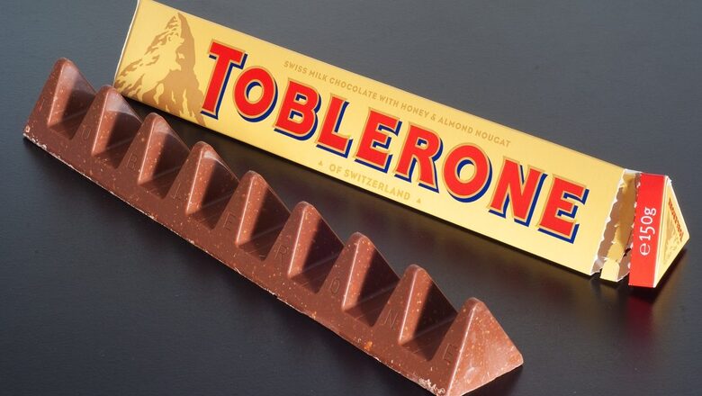
For decades, the iconic Matterhorn Mountain logo has been synonymous with Toblerone chocolates. However, fans of the Swiss confectionery brand may soon notice a significant change in the appearance of their favourite treat. Toblerone has recently announced its decision to remove the Matterhorn mountain logo from its chocolate triangles as part of a packaging makeover. Having moved some production to Slovakia, Toblerone does not meet strict Swissness criteria anymore. And so, it cannot use the national symbols of Switzerland (like the Matterhorn mountain) on its packaging.
In 2017, Switzerland introduced the “Swissness” legislation, a regulation that requires companies to demonstrate that their products are sufficiently “Swiss” to use national symbols and claim the coveted label. The legislation was a response to officials citing studies showing that a Swiss association can add as much as 20 per cent to the price tag of a product. They said the label had been “much coveted and misused” in Switzerland and abroad, causing damage to its credibility.
To qualify as Swiss-made, food products must now have at least 80 per cent of their raw materials sourced from Switzerland. For dairy and milk products, this number is at 100 per cent. However, cocoa is an exception as it is a natural item that cannot be produced locally.
Since the chocolate bar’s American owner, Mondelez, decided to shift some production to the Slovakian capital of Bratislava this year, Toblerone does not meet the Swissness criteria anymore. According to Washington Post, Toblerone has removed the Matterhorn mountain logo from its packaging in order to comply with the Swissness legislation. The logo, which has long been associated with the brand, will be replaced by a generic mountain design instead.
The publication quoted a Mondelez spokesperson saying that the packaging redesign “introduces a modernized and streamlined mountain logo that aligns with the geometric and triangular aesthetic.” Toblerone’s distinctively shaped boxes will see another change. They will now read “Established in Switzerland” instead of the present “of Switzerland.”
Toblerone had previously caused a stir on social media when it widened the gap between its chocolate and nougat peaks back in 2016.
Whatever the changes, the company claims that it has maintained the same recipe as the original, whipped up over a century ago in 1908.
Keywords: Toblerone; Chocolate; Swiss Chocolate; Swissness Legislation; Swissness Act; Matterhorn Mountain; Toblerone Mountain; Toblerone peak; Toblerone packaging; Packaging Change
https://www.washingtonpost.com/world/2023/03/06/toblerone-redesign-swissness/?utm_campaign=wp_main&utm_medium=social&utm_source=twitter
Read all the Latest Lifestyle News here


Comments
0 comment